• Skip to main content
  • Skip to primary sidebar

ICC Floors Plus Blog

Cabinets. Countertops. Paint.

  • Home
  • Blog Home
You are here: Home / Archives for Paint

Paint

Choosing Colors for a Jack and Jill Bathroom

August 7, 2020 by Shannon Vogel Leave a Comment

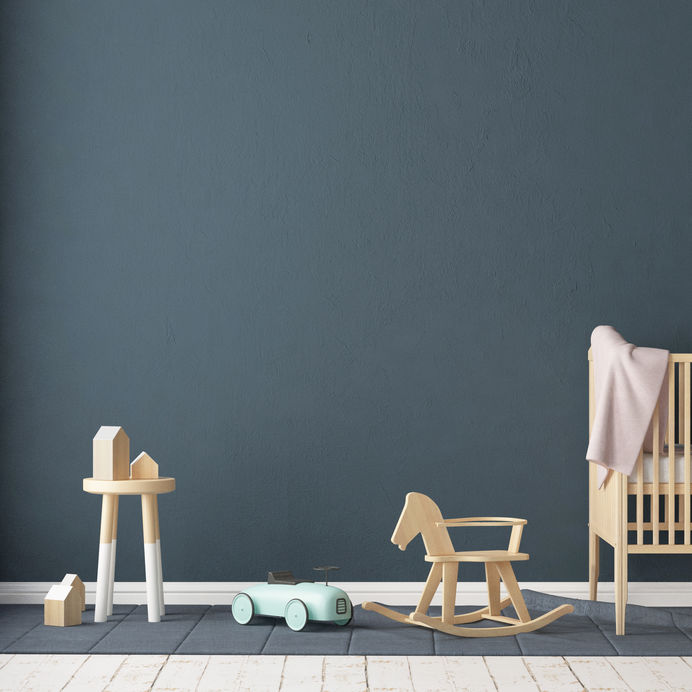
Jack and Jill bathrooms have long been used as a connecting area between two bedrooms. It’s not uncommon, in fact, for two children’s rooms to make use of the same bathroom. Unfortunately, this can lead to some decorating confusion on the part of the homeowner; how do you go about choosing a color for a room that is adjacent to two others? After all, chances are that your two kids’ bedrooms feature two different colors, and that bathroom ideally needs to coordinate with both. Thankfully there are several tricks you can use to choose the color of the bathroom to help everything blend.

Pick a Common Accent

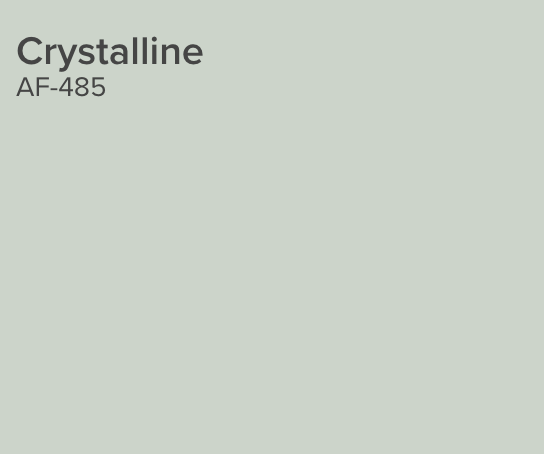
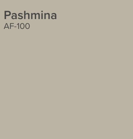
Go through the rooms on either side of the Jack and Jill bath and take a look at all the colors. Is there one accent color that shows up in both rooms? If so, consider making that the predominant color in the bathroom. For example if both rooms have a hint of sky blue, this can become the wall color of the bathroom, while other shades of blue or green mixed with white could make up the rest of the bath.
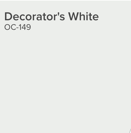
Go Neutral

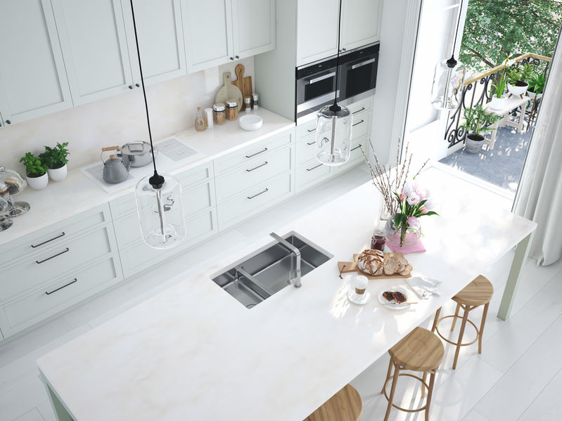
You really can’t go wrong with neutrals in a bathroom. White bathrooms are always a nice, classic choice, as are white and cream or black and white. This allows you to change out and mix up the towel colors and bath mats to suit the personalities of the two users, without making any permanent color decisions. This is particularly useful if your children are likely to change their bedroom colors as they get older.

Pick a Triad Color

This is a tricky choice and works only if the two rooms on either side are far enough apart on the color wheel. Triad colors are three colors that form a triangle on the color wheel, so if you have one purple bedroom and one green bedroom, you could pick a shade of blue for the bathroom and it would blend in well with both. The key is to make sure that all three colors are exactly the same distance apart from one another on the color wheel in order to work well.

Mix It Up

Don’t be afraid to create a mostly neutral bathroom with two or even three accent colors pulled from the bedrooms. The idea is to create a shared space, so don’t hesitate to share the colors as well.

Visit our website to see different Benjamin Moore color collections, color families and trends and favorites!

Filed Under: Colors, Paint Tagged With: bathroom paint colors, bathrooms, benjamin moore, jack and jill paint colors, paint

Benjamin Moore Paint Colors for Spring

March 6, 2020 by iccfloors Leave a Comment

Paint can completely change the entire feel and look of a room. Hence, paint is typically one of the first steps done by new businesses and homeowners to help tailor their space to their desired look. To help you create your dream oasis, we only provide the best products for your home projects. At ICC Home, we carry Benjamin Moore paints. Benjamin Moore is a paint company that creates exceptionally durable paint options for a variety of applications. Many people love this company for its price points and how efficiently one coat of paint can go. Plus, Benjamin Moore has a large variety of great colors. So if you are looking for some great spring colors, look no further. Today, we will focus on five colors that are perfect for your home design this spring. Let’s get started!

First Light |2102-70

Image by Benjamin Moore

Spring is almost here, and it is time to create a more vibrant atmosphere with First Light. First Light is an airy shade with light pink undertones. It works great as an alternative neutral option with a warm hue. Plus, it feels playfully revitalizing and very inviting.  

Golden Straw | 2152-50

Image by Benjamin Moore

Are you looking to illuminate and brighten up your space? If so, consider using Golden Straw! This color is excellent for adding that fun, upbeat spring vibe into the atmosphere. Plus, it is an enriched tone that is never too overpowering. In fact, its beautiful golden tint makes a great statement in any room and truly highlights the Golden Straw name.

Windmill Wings | 2067-60

Image by Benjamin Moore

With First Light and Golden Straw both having warm undertones, Windmill Wing is perfect for finding that balance. This cool tone is a pastel yet bold blue tone. It is clearly distinguished for creating a passive and peaceful atmosphere.

Buxton Blue |HC-149

Image by Benjamin Moore

Another blue option is Buxton Blue. This color is a refined and beautiful shade that has greenish undertones. In fact, this timeless color can help add cool tones to the room while enhancing natural and artificial feeling colors. Working great with all sorts of material, colors, and fabrics, Buxton Blue is a tremendous choice and inspired by America’s historic landmarks.

Crystalline | AF-485

Image by Benjamin Moore

Lastly, to finish off this sophisticated color palette is Crystalline. It has light green undertones but feels flourished in confidence. It is truly expressive and great to enhance the natural colors of nature like trees and grass.

Embracing the spring season is a great way to update your home! So if you love spring’s colors, make your home have that upbeat feeling by adding these great Benjamin Moore color options. And if you are looking for more recommendations, please do not hesitate to call or visit us!

Filed Under: Colors, Paint Tagged With: benjamin moore, color, colors, paint, painting

Frequently Asked Questions About Painting a Room

January 24, 2020 by iccfloors Leave a Comment

Paint can completely transform a room. It is simple enough that you can do it yourself while being cost-effective. However, if you have never painted before now, there are several questions that may concern you. To help, we gathered a few of the most commonly-asked questions to give you a better idea. Here is everything you should know before starting a paint project:

Q: How Much Paint Do I Purchase?

A: A general rule of thumb is one gallon covers 350 square feet. To calculate your wall’s square footage, measure the height and length of each wall. Multiply these numbers together to get your square footage of each wall individual then add all of the numbers together. Remember, some paints will need more than one coat, so a little more is always a safe bet.

Q: Where Do I Start?

A: Typically, you can start by “carving in” the room. This process is done with your paintbrush rather than a paint-roller. You will want to paint all of the areas that will be hard to get to with a roller. These areas can be seams of corners, where the ceiling meets, and at the baseboard. Next, you will choose to paint from the bottom up or vice versa. We recommend painting top to bottom since running paint can be inevitable.

Q: How Do I Remove Wallpaper?

A: Decide if your wallpaper was made to be stripped. If so, take a knife or a scraper and peel back a corner. This feature can make a project much easier, and it comes off in strips. That being said, you may need to use chemicals to help break the wallpaper free. Note that any chemicals used on the walls need to be removed before painting. You can also use a steamer to help break the bond of the adhesive. Typically, this will allow the wallpaper to peel off with ease.

Q: Does the Paintbrush Really Matter?

A: Experts and novice painters alike will agree that a quality paintbrush can make or break a project. In fact, the higher the quality of the brush, the better it will be at holding and releasing paint onto your walls. This feature will help minimize streak marks left behind by the brush. Additionally, you will want to clean the brush appropriately. Do not let the brush sit overnight with excess paint on it.

Q: Do I Need a Primer?

A: If you are using traditional paint (i.e., not a paint-and-primer option) then yes, you will ideally want to use a coat of primer. We recommend primers because of their helpful properties. Primers smooth the texture of a wall while properly sealing it for your paint. In essence, it creates the very foundation of your paint job.

Painting is one of the easiest do-it-yourself projects. It is quite cost-effective and can make an incredible difference in your design. Before you start, make sure you get all your supplies and clear the room of any furniture. Additionally, you may want to get a ladder and tarp the ground as well before starting.

Did you ICC Home features Benjamin Moore products? We are your one-stop-shop for everything design related. Be sure to stop in today for all of your paint needs and let us know if you have any additional painting questions.

Filed Under: Paint Tagged With: faq, how to paint, paint, painting tips

Prep: Before You Paint

June 22, 2019 by iccfloors Leave a Comment

Are you ready to tackle a new paint project with all supplies in hand? Before you begin, make sure you have your surfaces prepped! We know that prepping is the least fun task of the project, but it is critical if you want a stellar paint job. To help, we have listed prep job steps below to make this step easier and more organized. Let’s take a look!

Clear & Protect the Room

There is no doubt that you will probably spill, step, or sit in paint, so clear out the room and cover items in plastic to prevent them from getting splattered with paint. Look through your laundry room closet and look for old sheets and towels that you can put to good use! If you cannot recycle old sheets, you can purchase plastic drop clothes to help cover your valuables. Move what furniture you can out of the room, or at least place in the center of the room. Cover light fixtures with plastic or newspaper and secure them with painters tape. Do not overlook switchplates and outlet covers; simply remove them and put in a box for safe keeping. Also, remove or cover door knobs and door plates with painters tape.

Revamp Walls and Framing

Look around for peeling paint, and sand it with fine sandpaper. What about old holes from previous artwork? Caulk it, let dry, and sand with fine sandpaper. Now apply primer to the repaired areas and make sure they are dry before painting. By repairing these type of areas, you will completely cover the area instead of highlighting the damage by simply painting over.

Clean Walls and Framing

This step is a must! If you do not clean the area you are painting, the dirt and grease will seep through the new paint and highlight the poor paint job. Begin by pulling out the vacuum. Dust the walls, baseboards, all framing, and doors. Now start at the top of the wall and use a damp cloth and clean in a circular motion working yourself down and across the wall. You may also have to use clear dish detergent and water to clean doors and cabinets.

Painters Tape

After you have thoroughly cleaned and everything is completely dry, start using painters tape for the trim and windows. By using longer pieces, you will eliminate paint seepage. Painters tape is a dream product for painting and can be removed and reattached to surfaces.

Prime

Again, do not overlook this step; it is critical in the overall look of the final paint job. Primer covers imperfections and helps the paint go on smooth and realizes its true color! We start with priming the trim with a brush and finish by rolling the walls. Once the primer is completely dry, begin the final step of painting your amazing room!

As always, we hope this helps, and please let us know if you have any questions below in the comment section.

Filed Under: Paint Tagged With: paint, prep work

Top Benjamin Moore Paint Picks for 2019 | Part Three

April 19, 2019 by iccfloors Leave a Comment

Image Credit: Benjamin Moore

Colors can be a bit tricky to master. The colors we choose to put in our house will be with us for some time, so it is important to pick a good paint. Benjamin Moore is a premium paint and stain company. They have been committed, since 1883, to providing the highest-quality finishes in the industry. With over thousands of color choices, you will find the perfect color tailored to you to help create your space. Different colors become popular during different eras and this year is no exception. Benjamin Moore has put together a collection of their top selling paints to help homeowners create a flawless design. If you do not know where to start looking, perhaps consider some of these trending choices:

Pashmina

Image Credit: Benjamin Moore

This color is a balance of classic and modern neutral palettes. It is part of the Affinity Color Collection and pairs great with other colors in the series. Pashmina is an expressive color that can stand alone or help enhance others. Try using this sophisticated hue to mature an atmosphere.

Soft Fern

Image Credit: Benjamin Moore

Soft Fern is part of the Color Preview Collection. This pure soft color is a great neutral option for any home. It complements great with many colors due to its adaptable nature. Soft Fern feels authentic and timeless in any application and setting, and it is perfect for adding a little saturation to your home or to prepare it for resell.

Hunter Green

Image Credit: Benjamin Moore

Last year, pastel colors were very trendy. This year takes a much darker approach. Hunter Green is a deep green that enriches any room. Benjamin Moore suggests that it pairs best with Wildwood Crest and Going to the Chapel. Enhance any room in your home with this bold shade of green. It will always feel classy and extraordinary in any space.

Decorator’s White

Image Credit: Benjamin Moore

Who knew there were so many shades of white! Decorator’s White is a great place to start if you are looking to add white to your room this year. It is part of the Off-White Collection but adds subtle hints of warmth to the environment. Plus, it can enhance accents in dynamic atmospheres!

Paint can complete or add to any design. If you need any assistance in the selection process, one of our expert sales associates would love to help you. Please do not hesitate to call or visit our showroom for more information on our Benjamin Moore paint selection. Plus, if you missed part one or part two of our paint series, click the corresponding links to view them now. Thanks for reading!

Filed Under: Paint

Top Benjamin Moore Paint Picks for 2019 | Part Two

April 12, 2019 by iccfloors Leave a Comment

Exploring the world of colors available for your home can be fun; however, finding the perfect shade can sometimes seem like a daunting task. With no direction, you can be searching for quite some time that is why we wanted to share the top color picks for 2019 with you. Let’s take a look!

Image Credit: Benjamin Moore

Kona

Image Credit: Benjamin Moore

Kona is part of the Affinity Color collection. It is balanced by earthy tones to help make your home feel more established and comfortable. This coffee color can add some energy to your life, and it works great with any color in the Affinity Color collection. Being so well-rounded, this is a confident color option to put in your home or workplace.

Putnam Ivory

Image Credit: Benjamin Moore

Putnam Ivory is part of the Historic Color collection. This collection has gathered timeless remedies that have been refined to create the perfect color for your home. This traditional color celebrates American history, and it has proven to stand the test of time. While calming and simple, it never neglects to look sophisticated in any home.

Smoke

Image Credit: Benjamin Moore

This contemporary hue of grey has cool undertones to help relax your space. It is perceived as a more refined option. This practical tone is perfect for keeping a mature and sophisticated atmosphere. It has been known to pair wonderfully with Gray Shower and Burnt Russet. This color trio can make a powerful statement in any space.

Image Credit: Benjamin Moore

A subtle color that is soft-spoken can really be the perfect choice for many homes. This shade is a gentle white that has your atmosphere feeling airy and more open than ever. Finding the ideal white can be hard. If you are looking for a little more character to spruce up your space, look no further. This luminous, tender white can really be perfect for any home.

These are some of the most common colors used in 2019. They can be the perfect fit for your home or open your mind to other ideas or collections. Benjamin Moore has a large selection of inspiration colors to use in your home. Finding the perfect one may take time but is worth the investment. We recommend to try and find a color that complements your current décor and style best.

For more color inspiration, be sure to come back next week and check out our final post in the series. Plus, if you missed part one, you can view it here. Thanks for reading!

Filed Under: Paint

  • Page 1
  • Page 2
  • Go to Next Page »

Primary Sidebar

Stay in the know!

Get emailed each week when there's a new post!

  • Email
  • Facebook
  • Pinterest
  • Twitter
  • YouTube

Search for any topic you’re interested in!

Categories

  • About ICC
  • Backsplash
  • Bath
  • Cabinetry
  • Colors
  • Countertops
  • Design
  • Events
  • Family
  • Financing
  • Floorish
  • Floors
  • Have a Dream
  • Holidays
  • ICC Home
  • Kitchen
  • Make it Happen
  • Meet the Team
  • Paint
  • Plan the Project
  • Remodeling
  • The ICC Family
  • Tips and Tricks
  • Uncategorized
  • Website Tools

Recent Comments

  • Alex on How to Style Throw Pillows Like a Pro
  • Zoe Campos on Countertop Care & Maintenance
  • Angel Burke on Encapsulating Autumn with Decor
  • Blake on Project Completion – Tile
  • Jason Seltzer on Project Completion – Tile

Recent Posts

  • Creating Multifunctional Spaces
  • New Products that Wowed at KBIS
  • What’s Most Important in a New Kitchen?
  • Kitchen Cabinet Trends: What’s Hot Right Now
  • A Trip to the Islands

Archives

Copyright © 2025 · Genesis Sample on Genesis Framework · WordPress · Log in